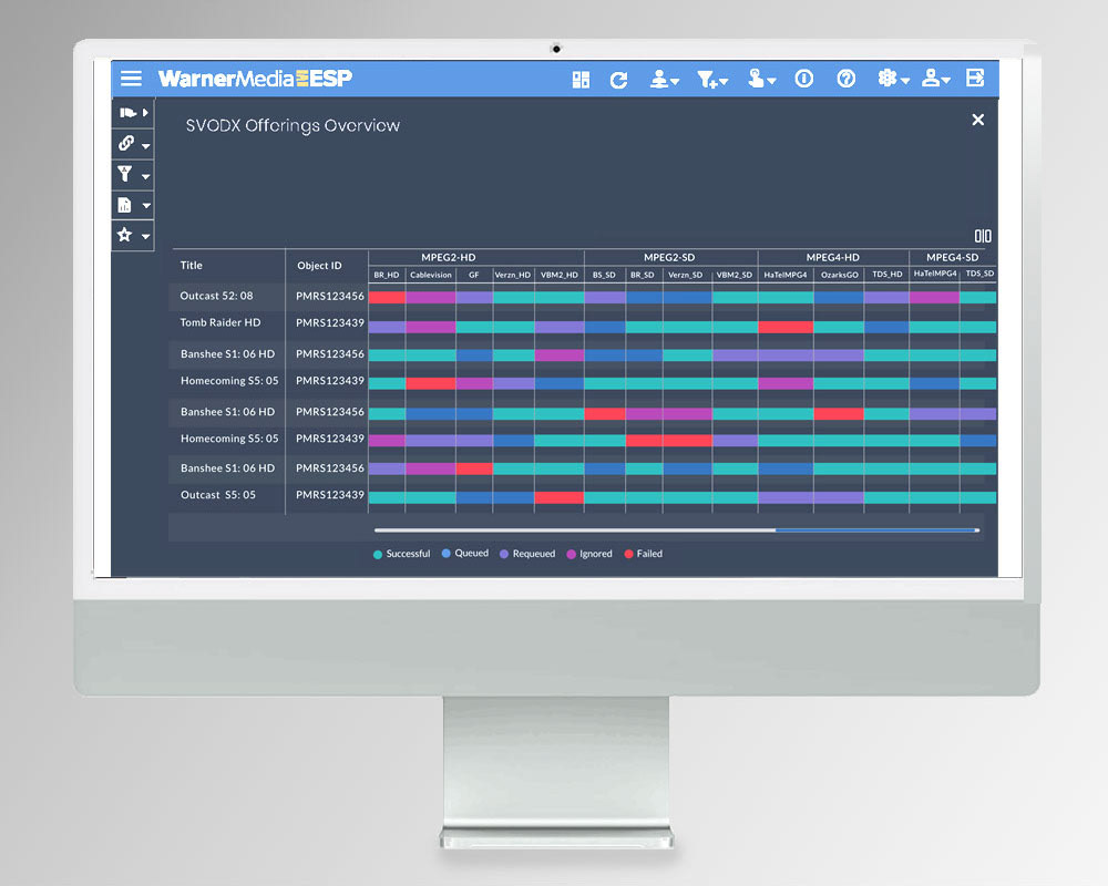
SITUATION: WarnerMedia legacy Media Transport Dashboard and Tracking Application was inconsistent, non-intuitive, slow, usable largely by an IT engineer and caused programming failures.
MY ROLE & TASK : I was the principal Product Designer on a team of 10 - IT manager, PA, product, development and engineering specialists.
ACTION: After extensive research and walk-throughs of the existing application & input with demos from the head engineering user, I determined a logical task flow, and then proceeded to UX, UI, stylesheets and QA assist. Applying best usability and design principles with responsive design. I sketched wireframes until we arrived at a consensus on the process and features of the application. Then, I designed a prototype with clean, branded page layouts, allowing for the user to interact at every stage in the UI with clear steps, and prevent programming delays and incomplete content in all offerings.
ACTION: After extensive research and walk-throughs of the existing application & input with demos from the head engineering user, I determined a logical task flow, and then proceeded to UX, UI, stylesheets and QA assist. Applying best usability and design principles with responsive design. I sketched wireframes until we arrived at a consensus on the process and features of the application. Then, I designed a prototype with clean, branded page layouts, allowing for the user to interact at every stage in the UI with clear steps, and prevent programming delays and incomplete content in all offerings.
RESULTS: The redesigned UI was built, delivered, and tested providing a well-designed, usable, and more intuitive
application for coordinating, and troubleshooting key components of major programming offerings by the stations.
application for coordinating, and troubleshooting key components of major programming offerings by the stations.
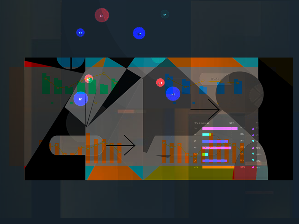
Paper wireframes
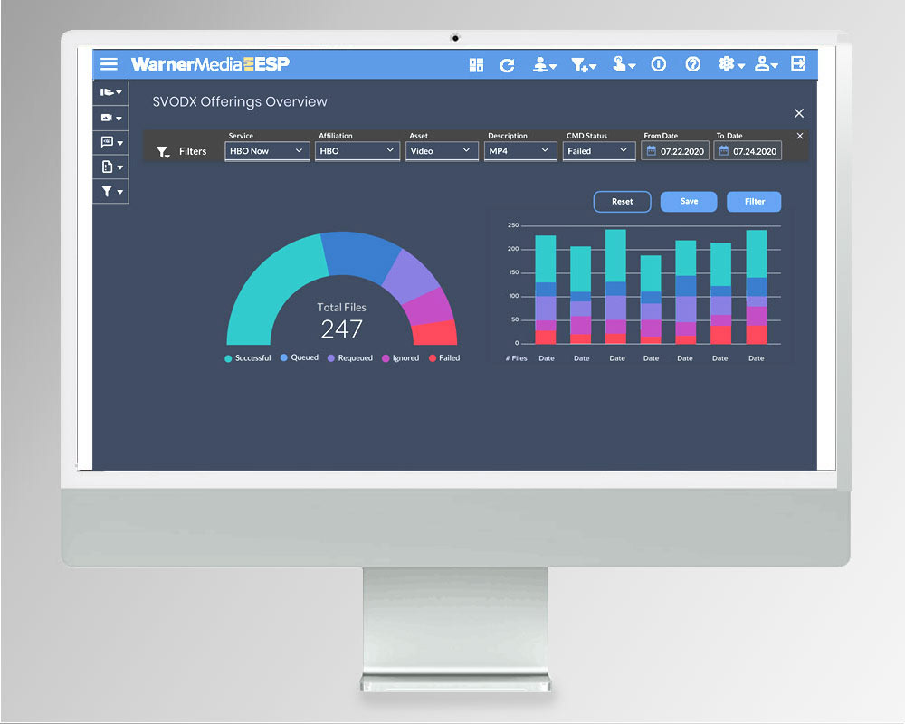
Charts with filters
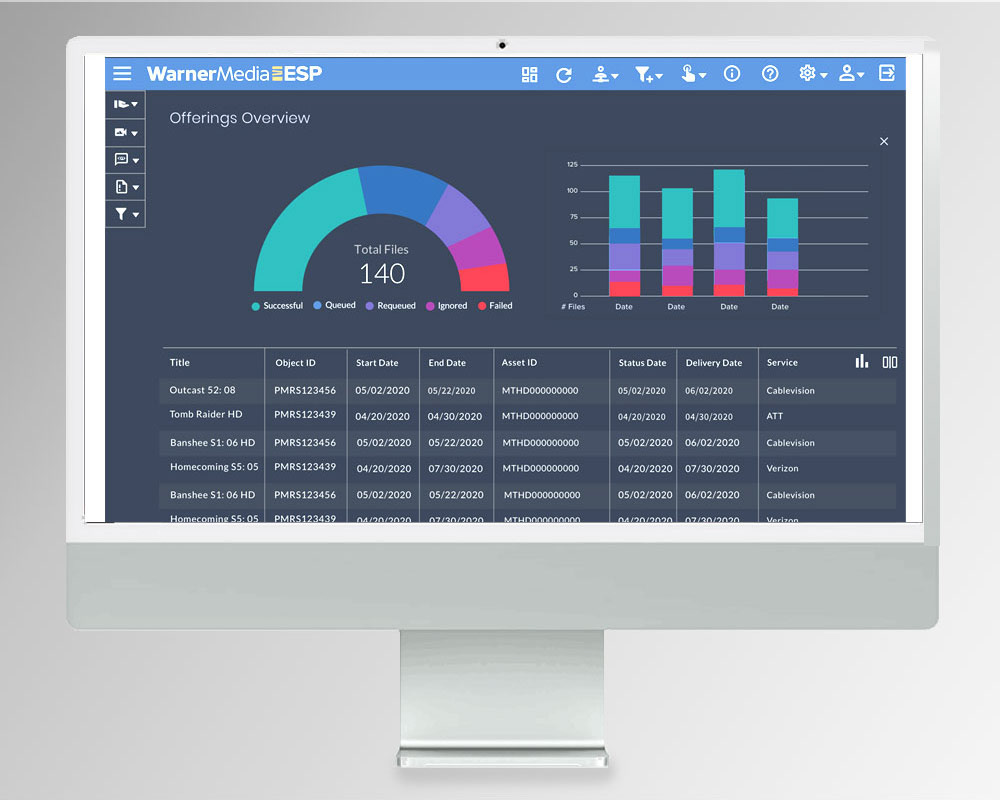
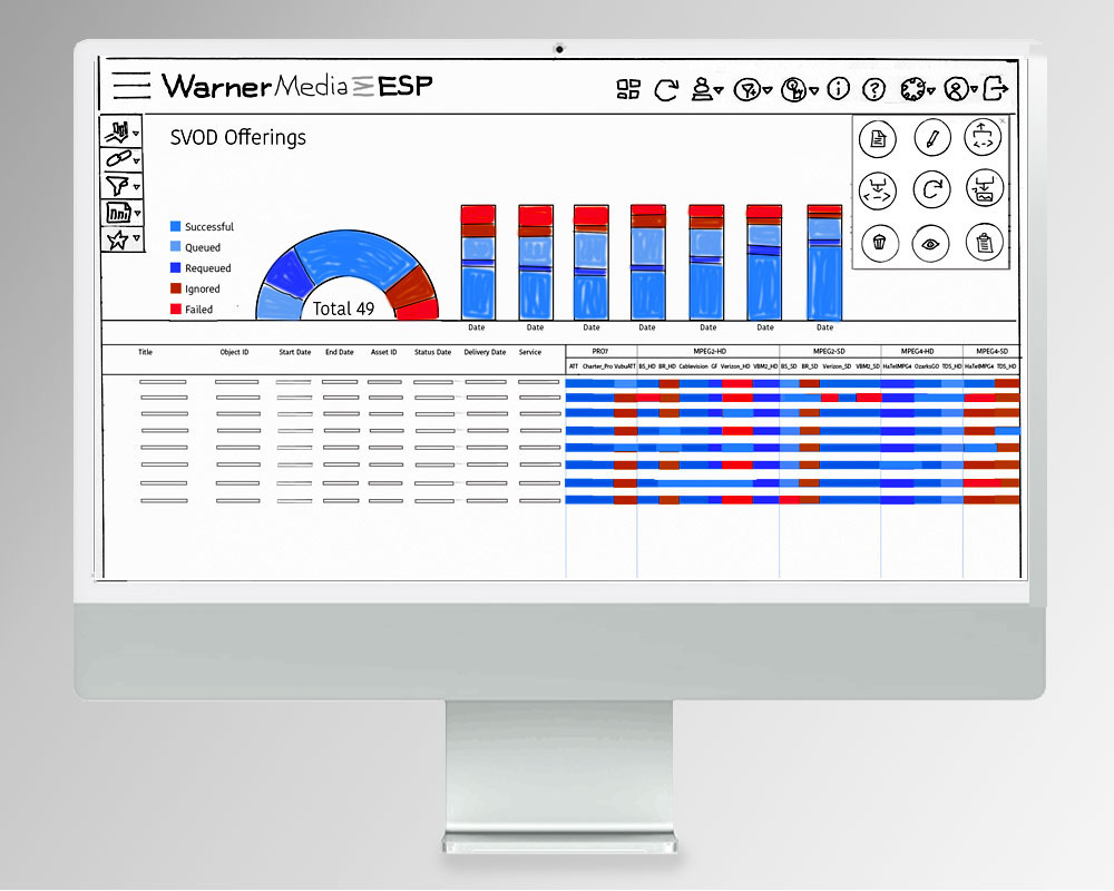
Charts with table