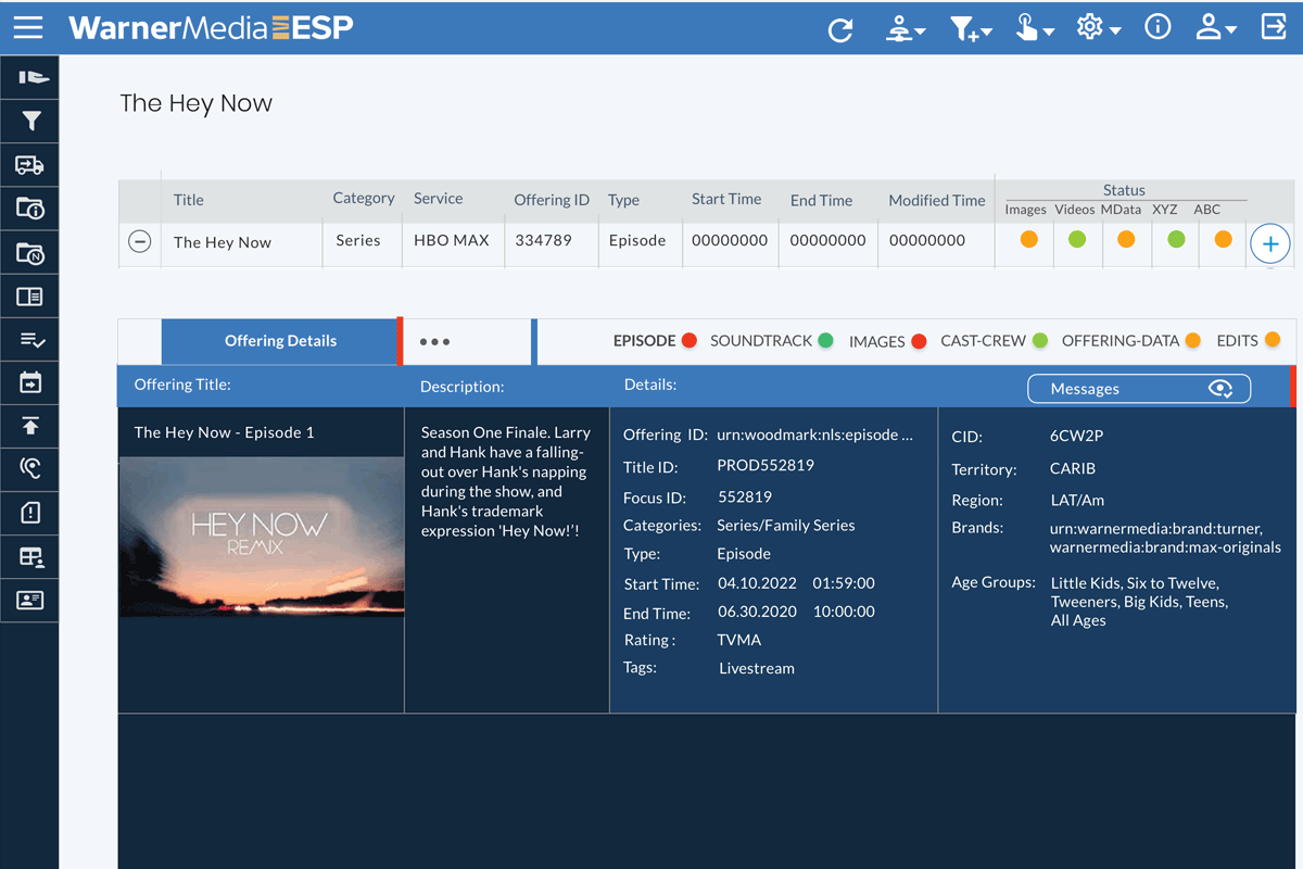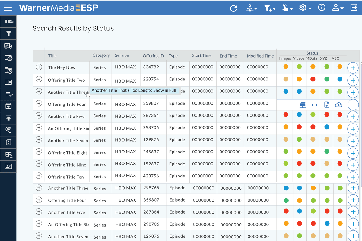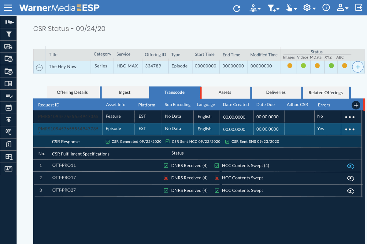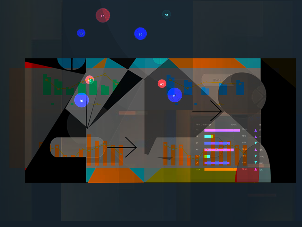
PROBLEM: HBO legacy Media Transport Dashboard and Tracking App was inconsistent, non-intuitive, slow, usable only by IT engineers, resulting in difficult, time consuming & error prone media tracking.
PROCESS: I was the Sr UX-UI designer on a team of 10 - IT manager, PM, PA, developers & engineers. researching, designing, prototyping, and helping deliver a new app with accurate media transport tracking, data-stats, notifications, wider usage and error prevention for timely media content delivery.
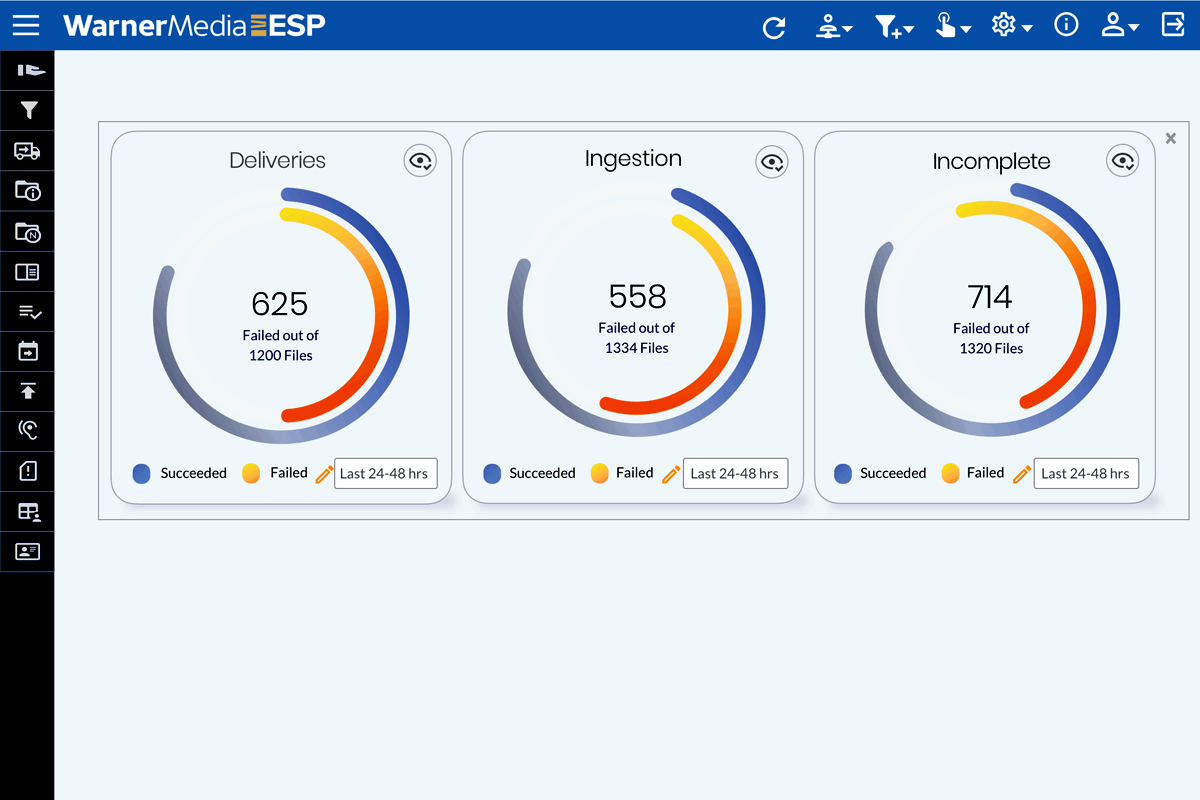
IMPACT: The new design was developed with an agile process, under my supervision. The new application improved the ability and accuracy to monitor and transfer media assets 50+%, adding users, accuracy, stats, and notifications.
REFLECTIONS: Being able to work closely with the IT manager and developers, communicating not only in stand-ups but also continually on Slack, greatly facilitated the design process and produced results where design reflected the initial concepts.