THE CHALLENGE: IBM's High Performance Dashboard v1 left many usability and functionality issues unsolved. Senior leadership needed richer data, sharper visualizations, and the ability to save and present findings — but the existing tool couldn't deliver. The ask: redesign it without losing what worked.
PROCESS: As Sr. UX Architect embedded in a global team of 22, I drove the end-to-end design process — from auditing the existing application and mapping user needs, through concept sketches, wireframes, and prototypes, to entirely new data visualization approaches. Every decision was measured against one goal: making this tool indispensable for IBM Management.
IMPACT: The redesigned dashboard delivered a 60% increase in usability for the primary user group — senior management — and significantly expanded the application's feature set. The improvement was felt immediately after launch.
IMPACT: The redesigned dashboard delivered a 60% increase in usability for the primary user group — senior management — and significantly expanded the application's feature set. The improvement was felt immediately after launch.
REFLECTIONS: The application update was made on time and on budget, as there was frequent management feedback from prototypes, keeping work schedules and goals intact.
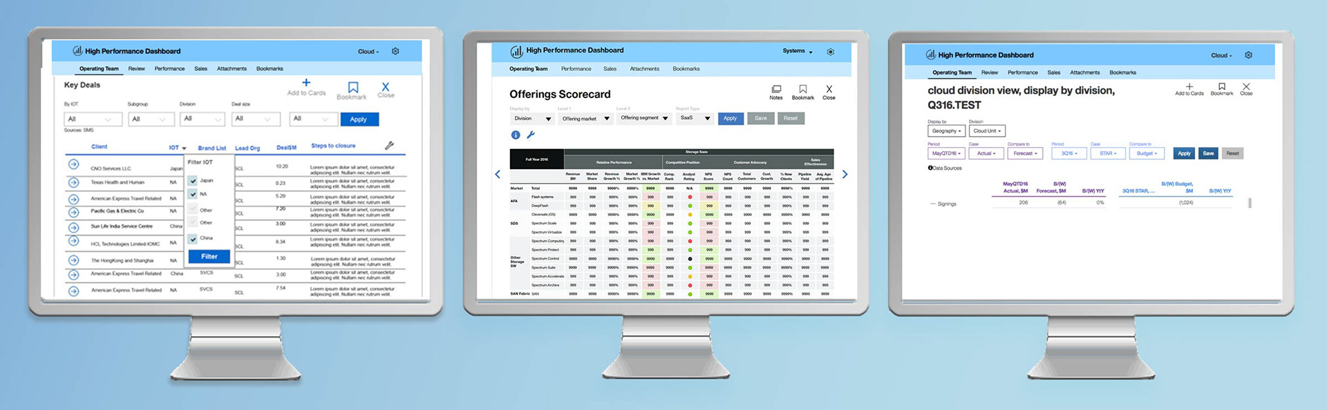
Previous version of IBM HPD (above)
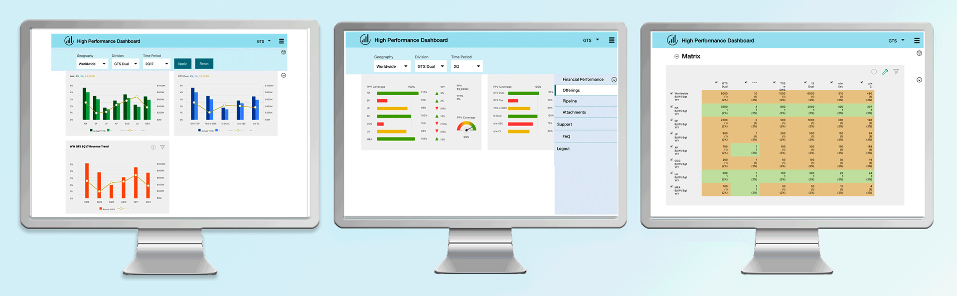
My updated v2 of IBM HPD (below)