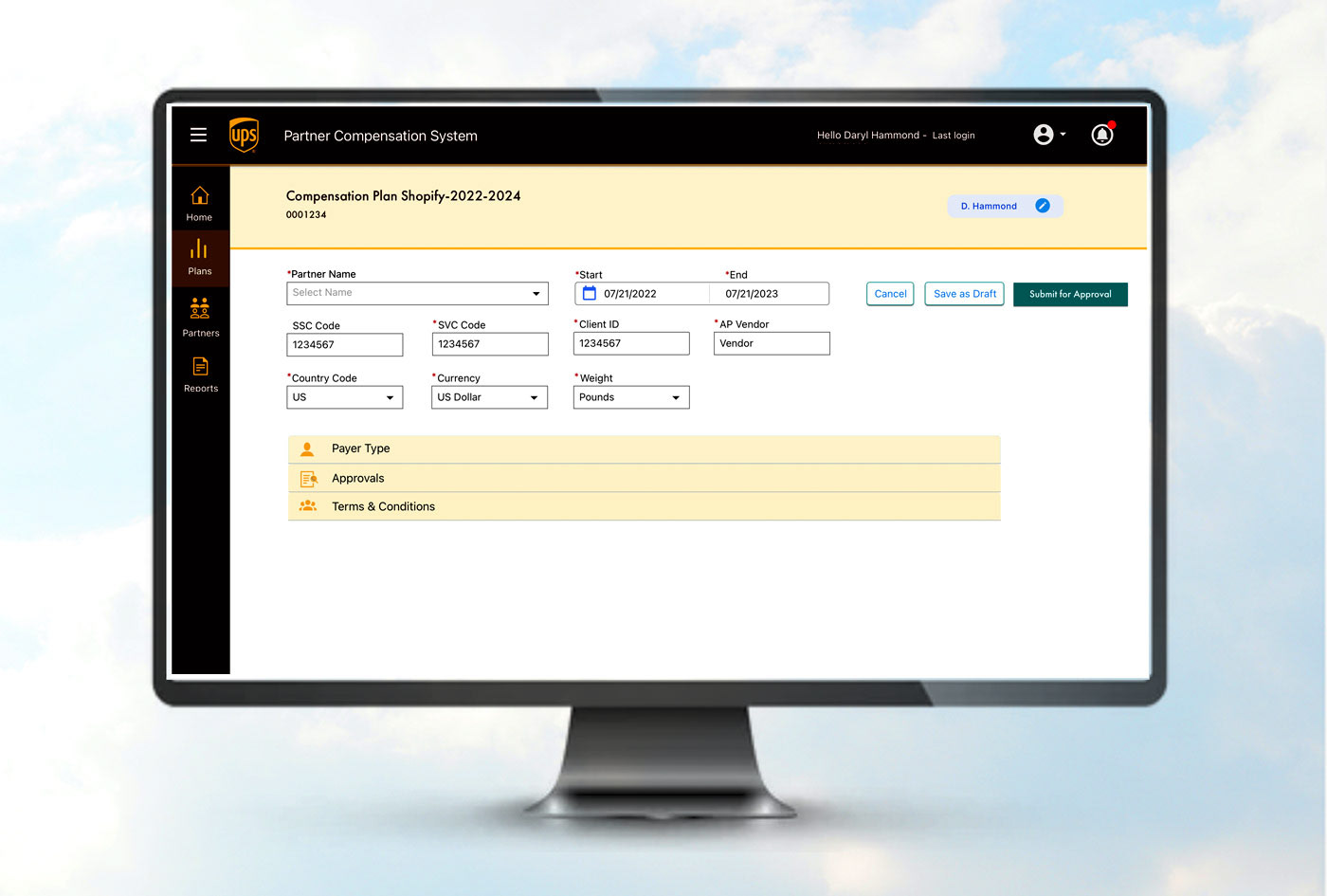
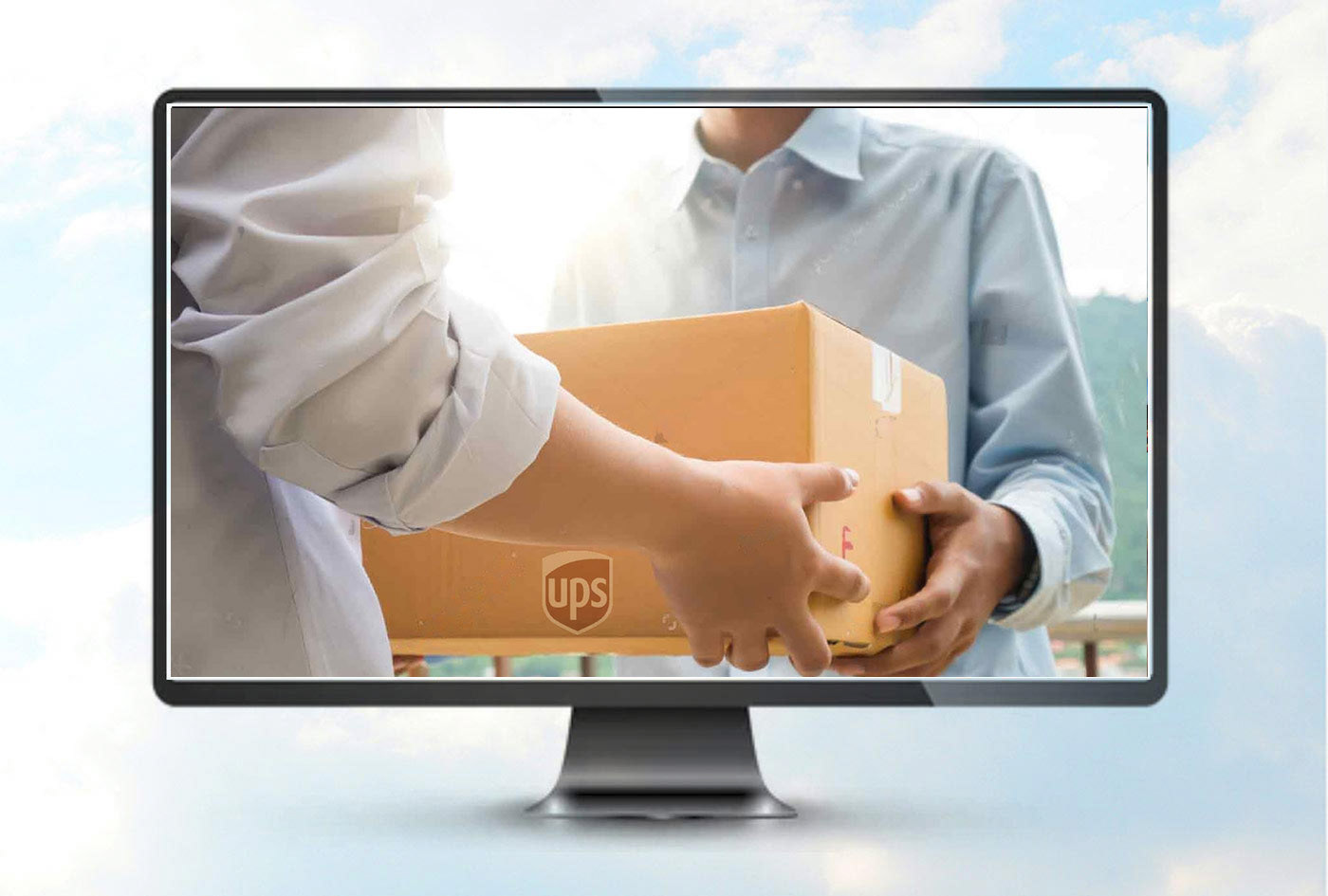
PROBLEM: UPS needed an application where frequent and volume users would be rewarded with a % of cash back of the amount they have spent with UPS shipping.
PROCESS: I was the Sr. UX Designer on a global team of 10. User research revealed an everyman type of user profile and extensive global usage. That meant the site had to be appealing, and the forms easy to fill out for everyone with maximum usability and accessibility.
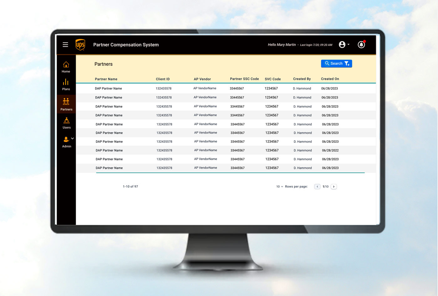
IMPACT: My initial concepts were based on the admin user, broadening the usability to all users. The design used UPS corporate branding, library and focused on clarity, consistency, accessible forms, and a fun-to-use application with ease of use for every level of user.
REFLECTIONS: The design was well received by the client but then modified to match original hard-sell low usability marketing ideas before publishing. I wish I would have had more time to research and provide user data to make the usability issue more important to the team.
Rewards for Usage
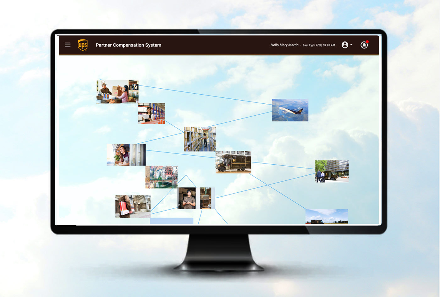
A people business
UPS Partners Page